FROM MY TO ME
Me is cheap, Me is easy to control, Me is easy to channel, Me is slave of its own reflection, Me is a slave of the platforms that make the reflection glossy. Me is data. Me is data closest to metadata. This makes Me just perfect to satisfy advertisers and to sate neural networks.
This article is an elaboration on the statements about the WWW, web design and personal websites I made in my recent talks1 and articles, as well as those included in the volume. As the editor (and probably the readers as well) noticed, as soon as I look for counter examples to new media products made following the cruel and hypocritical UX paradigm, I come up with a website – or more precisely, with a website of a particular genre – “the 90s GeoCities”.2
This selectivity has reasons and is intentional. As a keeper and researcher of the One Terabyte of Kylobyte Age3 archive, I am surrounded by GeoCities sites built and abandoned by amateur webmasters between 1995 and 2009. Amateur websites are central to my argument because they are the corpus of the archive and my research on web history. This focus is not accidental, though – it was developed from the thesis that personal web pages are the conceptual and structural core of the WWW.
Their emergence was accidental, their time was short, their value and influence were downplayed, they were erased or hidden. And since this arrogance of the IT industry and Human Computer Interaction (HCI) circles was also not accidental, but followed the call of the “invisible computer”, the core instrument of which is alienating the users from their medium, I chose to argue for the opposite and to illustrate the argument with artefacts that highlight moments in the history of the medium when its users were in power.
The choice of the word “moments” and the use of the past tense is also intentional and deserves comment. The fact that the time of personal pages is over is self-evident. What is obfuscated by today’s early web nostalgia (netstalgia) trend, though, is the fact that there was never a time for them.
Just as there was no Web 1.0 period by itself. First of all, the term is retrospective. And second: the Web 2.0 marketing claim made by the Silicon Valley of 20044 regarding the Web’s future should not be allowed to define 10 years of web history prior to it as being neither homogeneous nor the opposite. There was no 2.0 cut into the history of the Web that left certain content and forms – namely personal websites – behind.
Nor was there some sort of evolution or natural development that would make people stop building their personal websites. Professionalisation or faster Internet, which you could hear as reasons for amateur pages dying out, could have become the reasons for the opposite, for a brighter, rich and long tradition of people building their cyberhomes themselves.
There was no time in the history of the Web when building your home was celebrated and acknowledged by opinion leaders. The idea that you should invest time in building your corners of cyberspace was mercilessly suppressed by hosting service providers and “fathers” of the Internet. The sarcastic “They may call it a home page, but it's more like the gnome in somebody's front yard”5 was stated not by some social networking prophet, not by, metaphorically speaking, Mark Zuckerberg or Jack Dorsey, but by Tim Berners-Lee himself, and it happened as early as 1996, the year we usually see as a golden age of amateur pages.
I have several suggestions for those who decide to make their home page in the third decade of the twenty-first century. Most of them will appear at the end, but there is one I’d like to make right away:
Don’t see making your own web page as a nostalgia, don’t participate in creating the netstalgia trend. What you make is a statement, an act of emancipation. You make it to continue a 25-year-old tradition of liberation.
This text is part of the forthcoming book "Turing Complete User. Resisting Alienation in Human-Computer-Interaction" by Olia Lialina, that will be published in april 2021 through Heidelberg University Publishing. It contains five collected essays and will be available as print and open access, here on this website.
All the figures are screenshots of GeoCities web pages and are part of One Terabyte of Kilobyte Age Archive
Olia Lialina has published another essay on Interface Critique, called Rich User Experience, UX and the Desktopization of War.
To understand the history of the Web and the role of its users, it is important to acknowledge that people who built their homes, houses, cottages, places, realms, crypts, lairs, worlds, dimensions [Fig.1–13] were challenging the architecture and the protocols, protocols in a figurative not technical meaning. Users hijacked the first home page of the browser and developed this concept in another direction.6 A user building, moving in, taking control over a territory was never a plan. It was a subversive practice, even in 1995.
“Q: The idea of the ‘home page’ evolved in a different direction.
A: Yes. With all respect, the personal home page is not a private expression; it's a public billboard that people work on to say what they're interested in. That's not as interesting to me as people using it in their private lives. It's exhibitionism, if you like. Or self-expression. It's openness, and it's great in a way, it's people letting the community into their homes. But it's not really their home. They may call it a home page, but it's more like the gnome in somebody's front yard than the home itself.”7
Tim Berners-Lee didn’t intend to be sarcastic. It would be fair to quote the rest of the answer to see that what he called for was giving web users better, faster and more seamless8 ways to connect.
“People don’t have the tools for using the Web for their homes, or for organizing their private lives; they don't really put their scrapbooks on the Web. They don’t have family Webs. There are many distributed families nowadays, especially in the high-tech fields, so it would be quite reasonable to do that, yet I don’t know of any.”9
Such “webs” started to arrive some years later in the form of LiveJournal, Friendster, Facebook and other platforms that clearly showed web users that their part was to be connected and deliver content, not to build anything.
I don’t think that in 1996 anybody was really hurt or stopped making web pages because of the remark the father of the Web made. People building what was “not really their home” were reading other texts at that time: HTML manuals, web graphics tips and tricks, and source codes of each other’s websites. They would rather buy HTML for Dummies or Home Sweet Home Page and the Kitchen Sink than the WWW Consortium corporate journal.
Mentioning web design manuals is not a side remark here, but a suggestion to pay closer attention to the books that explained the World Wide Web to newcomers and taught them to make web pages as documents10 of the epoch: books such as Teach Yourself Web Publishing with HTML 3.2 in 14 Days; Building Your Own Website; Jazz Up Your Web Site in a Weekend; Frontpage Web Publishing & Design for Dummies; Publish it on the Web! – and other titles that shout: the Web is the future, the future belongs to you, learn HTML and embrace the future! The older the manual, the younger the medium, the more powerful and diversified is the role of the manual’s reader, the Web user. But in the context of this article I send you there not to look for the “good old days”. The manuals are also evidence of the personal web pages and their authors being ridiculed by experts: on the very same pages that motivated a newcomer you can often read “amateur” as a negative adjective.
“This page shouts ‘Amateur’"11
“There's nothing that says, ‘I'm an amateur Web designer and I don't know what I'm doing’ like 3-D logos”12
“Visit an amateur home page and see how excessive scrolling drags its nails across the blackboard of the user's experience”13
Already as early as in 1996, personal home pages as a genre and early web makers (as a group) were made fun of and blamed for all the ugly stuff. It is the year when David Siegel publishes Creating Killer Web Sites. Describing the history of the WWW till that moment, he announces the third generation of web design to come to replace the second-generation site, which for him was the world of amateur web and which he described as “At worst, noisy backgrounds and interminable waits for sound files make these sites unbearable. At best, they are nice white sites with color-coordinated icons”.14
“The audience for personal pages is basically only one person -- the creator of the site.”15
“It's perfectly OK for you to be as wild and crazy as you want because the only people who will probably visit your site are friends and family – and they are well aware of your lack of aesthetic taste.” 16
“ […] they cram every page with embedded MIDI (music) files, pointlessly scrolling JavaScript messages, huge full-color photographs, animated GIFs (flames and dripping blood are especially popular), and blinking and moving text [...] That is bad design, and (we think) bad markup, even if it validates – which is pretty unlikely because folks attracted to dripping blood animations tend not to spend much time learning about web standards.”17
The last quote is from Taking Your Talent to the Web, the book with the most beautiful title ever given to a manual. That’s why I borrowed it to be our library’s pseudonym.18 I also find this book very wise in many aspects: first and foremost for Zeldman’s conviction regarding the medium specificity of web practice and his attempt to divorce it from graphic design in this and other texts. Also, the work that he and his colleagues do at A Book Apart, a publishing house that makes manuals for contemporary web designers, cannot be underestimated. But I also think that it was a big mistake to neglect amateurs’ contributions to the development of the Web’s language.
In my opinion, people struggling to position a dripping blood animation in between two skulls and under <marquee>ENTER IF YOU DARE</marquee>, and pick up an appropriate MIDI tune to sync with the blood drip, made an important contribution to showing the beauty and limitation of web browsers and HTML code.
Making fun and blaming amateurs is only half of the problem. More damaging for the history of the Web was the ignoring of personal home pages and their authors in “how-to” books.
Neither the usability (Jakob Nielsen) nor the creativity (Jeffrey Zeldman, David Siegel) camps and their followers spared a page to analyse the home pages of amateurs, sorting things exclusively between themselves. From time to time they (as in Nielsen, Zeldman, Flanders) mentioned artists and web artists as exceptions to the rules they established, but not web vernacular. Even after designers of “photoshop” sites and dot.com unviable hybrids discredited the profession, experts suggested looking for new ideas among... professionals.
Veen: “I find inspiration in noncommercial Web creations”19 claims Veen and gives examples of designer portfolios.
“In order to move beyond a conservative, copycat style, you must look beyond the inbred corporate web to the personal sites of today's leading web designers”20 echoes Cloninger.
Danish researcher Ida Engholm in her 2002 paper “Digital style history: the development of graphic design on the Internet” wrote, “Web design has become an aesthetic phenomenon in its own right and with its own means of expression.”21
She continues: “Until now few attempts have been made from the perspective of aesthetic theory to develop reflective approaches to web design.” Ida Engholm was too cautious and modest with this remark. To my knowledge she was the first to attempt such an approach in the international academic press. And one can see that she was strongly informed (or misinformed) by the “how-to books” of the above-mentioned Siegel, Cloninger, Zeldman.
She writes: “[…] web design didn’t develop in a vacuum but shares features with development trends in 20th century design and art and with traditional design areas such as industrial design and graphic communication.” Following Cloninger she looks for web design roots in Swiss Style and Grunge, and discusses Kilobyte Minimalism, Hello Kitty and other popular online, but still graphic, design styles.
Indeed, web design didn’t develop in a vacuum, it grew out of vernacular web, it grew in opposition to vernacular expression. But there was obviously an information and education vacuum created around it by authors of design manuals and other experts and evangelists.
Only in 2008, in Fresher Styles of Web Design, Cloninger, following Cory Archangel’s Dirtstyle,22introduced “1996 Dirt style”, which he attributed to Myspace, blingee.com and other sites and communities “greatly influenced by hobbyist created personal home pages circa 1996”23 without giving a single example of any website from that era.
No wonder that young web designers think that responsive web design was invented this century, although Ethan Marcotte never hid the fact that he only coined the term,24 brought back and popularised the principle of liquid layouts, which was very popular among personal home page makers of the mid 90s; and why Aaron Walter, the author of Designing for Emotion25 – a web design manual that explains step-by-step how to create a service in a way that its users think that there is a real person behind it – dares to deliver his point without once mentioning a personal home page.
Webmasters and their production were an easy target. Professional designers, evangelists – they all took the opportunity: ridiculing, discrediting, alienating, exposing clean styles and templates, usurping the right to make design decisions.
And they succeeded, they protected the Internet from “wrong” colour combinations…, annoying background sound, from marquees and blinking, but in the long term it was the beginning of the end of web design itself. The rhetoric of alienation that design experts practised in 1996 was picked up by IT giants a decade later.
To quote Vincent Flanders’ (the extensively quoted above Flanders, who, book by book, article by article, humiliated websites that were too bright, too loud, too confusing) tweet from 4 years ago: “in 2016 web design is what Google wants it to be”.26 Even more true in 2020.
There is no web design and web designers any more, there are graphic designers and developers again, front-end and back-end developers this time. For me as a net artist and new media design educator, this splitting of web designer into graphic designer and front-end developer is bitter, because it is the death of a very meaningful profession.
“Web publishing is one of the few fields left where the generalist is valuable. To make a great site you need to know a little bit about writing, photography, publishing, UNIX system administration, relational database management systems, user interface design, and computer programming,”27 writes Philip Greenspun in Philip’s and Alex’s Guide to Web Publishing in 1999. It would be naive to think that it would work the same way two decades later, taking into account the complexity of modern online products. But still the web designer is a generalist in a leading position. But knowing a bit of everything is not the most important part of the profession. The generalist as web designer is a person who sees the medium designed and shows it to the users, a person who is growing up together with the medium (and never gets old because the medium is forever new) and who has the potential to reshape it, because intelligence is still on the ends.
“Web designers are still there though, I think. Just maybe more and more are actually growing into Frontend developers or turning to something more specific like becoming UI/UX designers, or Product designers. It's less browser focused maybe, less ‘web’? Even though most of these still technically rely on web protocols and technologies”28 – net artist at night and “full-stack developer with more experiences as a front-end developer” –, Émilie Gervais sees it more optimistically in our email correspondence but still confirms the shift: the Web is not a medium but underlying technology.
Underlying and invisible. Most of the digital products and interfaces we use today are in fact browsers opened in kiosk mode. The majority of mobile apps, digital signages, installations, and other big and small “experiences” are constructed with HTML, CSS and JavaScript. Front-end developers who can talk with screens and layouts in these languages are demanded, celebrated, well paid … but harmless; they master technologies without ambitions to master the medium.
Without web designers, the Web is left to front-end developers who implement Material Design guidelines (“what Google wants it to be”), graphic designers mix-n-matching “illstrations for every occasion”29 – and for the rest of us there is Artificial Design Intelligence (ADI).30
“There is no room for ornament on the web. People want to look at Instagram […] because their brain already understands how Instagram is laid out. In my opinion the goal of an artist vs a UX/UI/product designer is totally opposite. To combat templatization and minimalism I try to exaggerate designs with ephemeral styles and effects,”31 -- says Steph Davidson. She is web art director at Bloomberg, a publishing house that actually makes an effort32 to revive the genre – with a website that is different. Bloomberg designers are not the only ones. There are exceptions and we identify them as such. For example, every work of German web design duo Christoph Knoth and Konrad Renner makes people say “wow, the Web (design) is alive”. They confirm that “there is a small movement that is fusing web design back together with new tools. We design and develop frontends and backends and it feels like a perfect habitat for our work. We are the living proof”.33
“Small movement” is very important for rescuing the profession and the idea that one – be it a publishing house, a festival, a journalist investigation, a person – needs a website.
“[…] the idea of a site and its relationship to our online identity has far more depth of possibility than ever before, which makes me think the concept of having one’s own site online might never be more relevant given how ‘homeless’ our digital presence is online currently,”34 writes co-founder of Reclaim Hosting initiative, Jim Groom.
The homeless status is a reality for individuals, who never know when Facebook will implode together with their images and interactions, and for institutions begging Google and Wikipedia to edit their “knowledge panels”. Experts and celebrities are not better settled than naive users of Instagram.
Nothing is more eloquent than popular tech journalist Katie Notopoulos tweeting: “I had an idea for a blog, but realized that there's nowhere to like, make a new blog (rip tumblr), so I think the best blogging platform now is.... a really long caption on an Instagram?”35 or aforementioned web design guru David Siegel, whose web home today is a link list on Medium.36 Many links to his own text about the future of the Web once published on dsigel.com point to the Wayback machine.
The father of hypertext gave up updating hyperland.com and directed it to his YouTube channel.37 The mother of Post-Internet made a spectacular home page38 for marisaolson.com – the rest of her portfolio is outsourced to blocks and channels on arena.com. Among the ruins of online portfolios rises the home page of artist Petra Cortright,39 who links everything she’s done in between 2012 and 2019 to “petra cortright 2019 2018 2017 2016 2015 2014 2013 2012” on lmgtfy.com – a very contemporary gesture, which could be interpreted as both despair and arrogance.
In this situation I think a new role and an understanding of web designers could be rebuilding homes; showing gnomes the way out of corporations’ front yard, if I may steal Tim Berner-Lee’s metaphor.
These are not “ornaments” per se, Davidson mentions, and not the awesome audio visual effects Knoth and Renner provide to their clients; it is the notion of having an appearance – that they bring back by exaggerating it – and subsequently a place of your own outside of standard interfaces and grids of algorithmic timelines.
*
To turn designers and users away from technology and back to the medium one should try to adjust the optics and see the people who made the Web, to write the history of the users (not corporations that released these or those products, or updates) and frame it in a continuum of their actions, views, self-identification. Not an easy task because on the Web we are always confronted with revolutions, with histories of big men and binary time40 and space: before/after, web 1.0/web 2.0, desktop/mobile, flat/material.
My slow climb from 1995 to 2004 in the 1TB archive, my personal journey online that started in 1994 and is still not over, as well as two decades of teaching new media designers to see and show the environment they work with, we should recognise several trajectories we (web users) took since 1993.41
From web designer to front-end developer could be one of these trajectories. This is partially introduced on the previous pages. To make it complete I’d first of all have to place it in a more complex, forking path, starting from webmaster (not web designer), following the genesis and metamorphosis of that profession (passion) through time and niches of the Web.
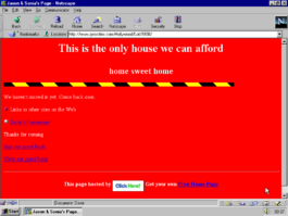
Figure 1
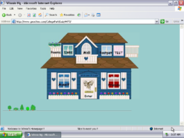
Figure 2
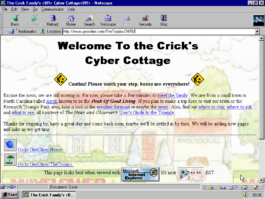
Figure 3
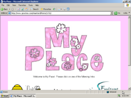
Figure 4
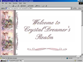
Figure 5

Figure 6

Figure 7
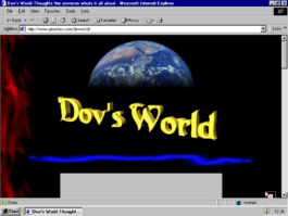
Figure 8

Figure 9
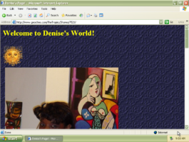
Figure 10
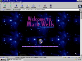
Figure 11

Figure 12
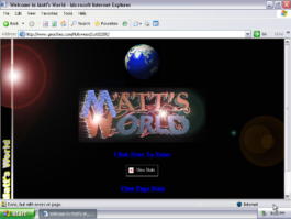
Figure 13
Another trajectory, which would demand a longer text, is Under Construction → Update → Upload. The history of the Web distinguishing three generations – three “Us”. Where Under construction stands for building the Web; Update for having difficult relations with the Web, not having time for the Web, it’s complicated, “get a real life”, and more [Fig 14–16]; and Upload – users’ involvement reduced to feeding the forms with photos, texts, or other types of “generated content”.
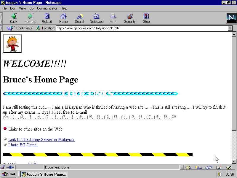
Figure 20
Let’s have a closer look at “topgun’s Home Page” [Fig. 20], made and last updated in September 1995. A significant one for the archive: first of all because it is the oldest; second, it is one whose author I could trace, which is rarely the case; and third, because the creator, the person behind Bruce who is testing how to make a web page is none other than Ganesh Kumar Bangah, a big name in South-East Asian IT world: it was he who bought Friendster in 2009.42
In 1995 he was 16 years old and made his first home page by modifying a sample page made by David Bohnett, himself the founder of GeoCities, who was 40 at the time, but had maybe only some months more experience with the Web than Ganesh Kumar Bangah. David Bohnett’s first page was not saved, but in an interview he recalled that it was visually identical to Ganesh’s one (it was anonymous and placed into Hollywood Neighbourhood). This sample suggested two major ideas to the users signing in to his platform: they should or could be “under construction” and contain “links to other sites of the net” [Fig. 21–23]. A must that people took seriously, replacing Bohnett links with their own. Making links being the node was the duty,43 the reason or an excuse to be online. You are maybe not an expert in anything, you are not a fan of anybody, but you can provide links to others and that’s a noble role. These links could be to search engines [Fig. 18,24] and this didn’t look like a paradox.
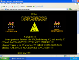
Figure 14
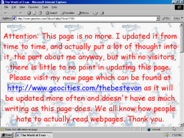
Figure 15
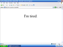
Figure 16
“Links are the spice that makes the Web so interesting. Links perform the magic [...]”44
“There are no rules about which documents can point where – a link can point to anything that the creator finds interesting”45
“If you are building a site for people in growing roses, don't stop with just pictures of your roses; include the list of rose resource links”46
“Good home pages provide useful resources and links to other Web documents. Web is a project in community authorship”47
“There are sites that help you find people, sites that help you find jobs, sites that help you find other web sites,”48 The authors of the design manual Home Sweet Home stated in 1997, and they didn’t mean Google or search engines, they meant that it is a valid reason to create a website.
“There are plenty of sites around the World Wide Web that exist only to provide a Web ‘mouse potato’ with huge lists of links to pages that are informative, entertaining, or “cool”49
“Traditional home pages easily degenerate into an endless vertical list of links.”50 David Siegler’s remark sounds like a prophecy, knowing what happened to his own web presence. Indeed, webmasters were aware and often made an effort to transform the list into something rather intriguing, imagining and structuring them as a lava lamp [Fig. 25] or Christmas tree [Fig. 26]
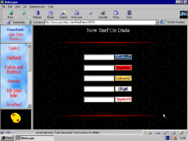
Figure 18
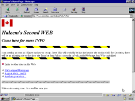
Figure 21
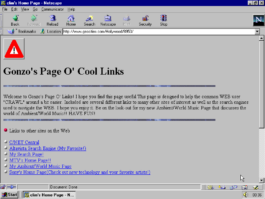
Figure 22
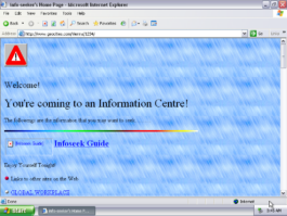
Figure 23

Figure 24
The latter, “Links are us”, deserves special attention. It provided 100 links to what were, in 1999, important sources. Netscape is still there, Google is already there. Hans Hollenstein links to whitehouse.gov as well as “~” folders on .edu servers. But what does he put on the top of his Tree Full of Links? What’s the shiny Christmas star? Is it Microsoft? Apple? Yahoo? No, it is the author’s own complete solution to Rubic’s Cube51 as a Java applet… His invention, his pride and his right to make the link to it more prominent than links to the giants.
Back to our times. In the winter in early 2020, I taught a project “go as deep or stay as shallow”, which is a quote from Joshua Quittner’s Way New Journalism manifesto,52 an optimistic text published on Hotwired in 1995, where Quittner called to the journalist of 25 years ago not to be afraid of making links to immerse themselves in the world of hypertext and hyper images OUT there, outside of your text or publishing platform. The group I was teaching was very young. I knew I would be the first to tell them about the difference between the Internet and the WWW, the history of hypertext and hyperlink, the values of EtoE and the treasures of p2p, and of the urgency of breaking out of walled gardens, the importance of not obeying the one link Instagram allows you. I was prepared to start from the basics. What I was not prepared for was that students would ask me what I mean by the only one link that Instagram allows its users? Where is it?
They didn’t know about the link, they didn’t see it, and were not missing anything. I was trying to fire up a resistance against the cruel policy of Instagram, but achieved the opposite. It made Instagram even more generous in their eyes.
Then I told this to an older student of mine. By “older” in this case, I mean she had already had a conversation with me about blue underlined words some semesters ago and had produced several great projects. She said that, with all due respect to all the links I made, Instagram’s policy of not allowing links is great, it helps her to stay concentrated and to see only what she wants to see.
This is not a story about young people,53 it is the destiny of computer users of all generations. Adapting, forgetting, delegating.
So often we hear and say that things change very fast. I don’t know what is fast or what is slow, but what is clear to me is that the adaption of computer users’ mindsets keeps up with this pace. First you stop making links, then you stop following ones made by others, then you ask, “what’s a link?” Like a girl in the Apple commercial asks “What’s a computer?”54, a question that is supposed to portray the ultimate quality (transparency as invisibility) of a consumer electronic product.
Computer users accepted that making links is not their business. Instagram’s one and only link in bio is not a question of the amount of links but the fact that the decision to make hypertext is not a prerogative of the users.
“Free speech in hypertext implies the ‘right to link’, which is the very basic building unit for the whole Web”55 writes Tim Berners-Lee in 2000. He adds, “if the general right to link is not upheld for any reason, then fundamental principles of free speech are at stake, and something had better be changed.”56
Links were indeed perceived so “basic” and “fundamental” that no contributor to user rights platform thought about adding a demand to link in 2013 or later. I noticed this while finishing this text and tried to improve the situation by placing my demand.57 But one thing that has long existed is the unwillingness of corporations to make external links and the rise of walled gardens, where hypertext is only inside,58 and links are made between documents not servers. And another is service providers taking away the technical possibility of turning text into hypertext, media into hypermedia, even inside one platform.
The <a href> tag is the most essential tag of HTML. A is for “anchor”, HREF is for hypertext REFerence – <A HREF> is to tie, to weave, to knit. One would think it is the essence and the core, but we see more and more signs that in a year or two it will be “deprecated”, browsers will just ignore it as some sort of <blink> or <marquee>, as if it is something decorative, but unnecessary, just a feature, that can be removed.
Content management systems and WYSIWYG web publishing (among other solutions that would make publishing instant) made a very attractive offer to their users: authors don’t use tags to make links, just type “https://” and the platform will recognise it and automatically turn the address into the link. But a decade later they started to change their mind and URLs stayed inactive, appearing more as noise than information. Since 2016, Instagram users have wondered how to make links, how to go around “non-clickable URLs”,59 as hyperlinks are now called – an absurd collocation for an environment based on hyperlinks. “For the Web, the external link is what would allow it to actually become ‘worldwide’”,60 to quote its inventor once again.
There are more sad neologisms around, for example the “Clickable Links”61 extension I installed to make URLs “work” in Chrome, or “Linkificator”, it’s analogue for Firefox. Not to mention PANs like linktr.ee and il.ink, apps that you have to install to move round the only link Instagram allows. The mere existence of the apps shouts about the absurdity of today's web, the hypocrisy of social networks and the misery of their users. “The only link you’ll ever need” is linktr.ee’s slogan, with which I marked the current moment in the trajectory.
“... hyperlinks aren’t just the skeleton of the web: They are its eyes, a path to its soul.” Iranian blogger Hossein Derakhshan wonderfully said in his 2015 post on Medium, the title of which was “The web we have to save”.62
Derakhshan spend 6 years in prison for his posts online. He was released, went back on the Internet and viewed it as terrible that Facebook would not let him link properly and control the presentation of his texts. He was absolutely right in his critique.
At the same time I remember being puzzled when reading this text 5 years ago, because I realised that in his memories WordPress was paradise for links and the golden age for hypertext and the Web we have to save. How could this be? In my chronology, WordPress was the platform that started to take away users’ control over the links; it is precisely WordPress that should be blamed for disrespecting hypertext, as it filled the Web with zombie links.
The question is rhetorical. We know the answer: we (users of free publishing tools) forget or adapt or accept very quickly.
Much like the false memories about WordPress is the current Myspace nostalgia,63 namely the part where people recall their time on this platform as a time when they were coders. US scholar Kate M. Miltner presented her research “MySpace Had Us All Coding”: A Nostalgic (Re)imagining of ‘Web 2.0’”64 about it at last year’s conference “The Web That Was”. Again, I had the impression that she was talking about another Internet or Myspace, because I remember the opposite, and in 2007 I wrote about Myspace as a platform that took HTML as a source code away from people.65
But true, when you compare the Myspace of that time with any service of today or even the Myspace of today, you feel like you were a coder if not a programmer. You could copy and paste glittering text code, decide whether sparkles are purple or pink.
I asked the audience whether, in a few years’ time, teenagers who are now on Instagram will recall 2019 as a paradise, as a free wild web, a place when they were coders? Can it be that people who are on Instagram now will be nostalgic about the freedoms they had?
“Of course! Thank you, Instagram – we were allowed to upload!” Alex Gekker of Amsterdam University shouted from his seat.
Indeed, happy times when you could decide yourself to post a pic and not your phone doing it for you automatically. We will be recalling the 2010s as a time when we could post images ourselves.
Good old times... Remember Instagram where you could post an image?
Remember Google that allowed you to type your search request? We had Twitter! You could unfollow people! Yes! Yes, in 2020 there were browsers that had a location bar and you could type in an address of a site!!
What? Address bar? Website? You could type? Was there a sort of typewriter?
Delegating, adapting, forgetting.
Another timeline that vividly exposes this path would be from making a website for your own dog to reposting someone’s cat. There are transitions in between these extremes: making a website for a cat, or posting your own cat. It is a trajectory to follow, to investigate. Again it is not binary, not just a dog’s web for Web 1.0 vs a cat’s web for Web 2.0. Though my research shows that cats, which later became a front-running symbol66 of being online, played a small role in early web culture, and had another function.67
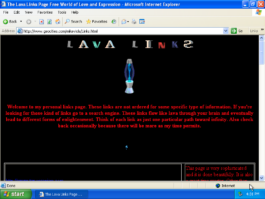
Figure 25
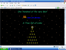
Figure 26
The page [Fig.27] is one of 848 pages tagged as “dog” in the One Terabyte of Kylobyte Age archive (as of june 7, 2020). The most spectacular ones have become part of an ongoing online exhibition.68 Many of these pages are made in memory of a dog, many to celebrate a new puppy, some are personal, others belong to breeders. There are monumental and very simple ones, and some that I found are especially stunning. I tag them as “dog” and “webmasters” and there are 99 of them at the moment. Almost 100 of 848 dogs claimed they made their webpage themselves.[Fig.28–30]. We (people who are a bit older than these pages) know that it is not true. But for how long will this knowledge be there?
Chances are that the number of people who have ever heard about web pages made by people themselves is getting smaller every month. At the same time, the chances that your dog, cat or hamster doesn’t need you to share its pictures and sounds online are getting higher every day. I’m sure that if you return to this exhibition in ten years from now and see the screenshots, you won’t be surprised by dogs showing off their pages or posts. Theoretically, some sort of Alexa could probably already do it today, automatically photographing your pet, streaming it live, translating its barking into words and whatever.
And that’s why I invite you to go into these pages in more depth: not to forget that these dogs were not dogs but people who spent a few weekends learning how to make a web page, and it was so exciting and so much fun that they also made them for their dogs. People, not dogs, not AI, not UX were making decisions about URLs, links, navigation, layouts, colour palettes and content.
Webmasters of the 1990s built homes, worlds and universes. But also, outside of intergalactic ambitions, they strongly pushed the concept of something being mine. The first-person possessive determiner “my” took on a very strong meaning – “my” because I build it, I control this presentation; my interests, my competences, my obsessions: in the trajectory from my to me, I suggest following its decline.
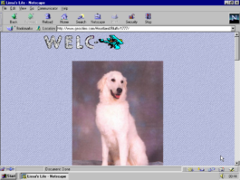
Figure 27

Figure 28
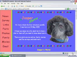
Figure 29
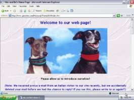
Figure 30
[Fig.31–45] My Steven King, my Korn, my page for Sandra Bullock, my Eminem, somebody else’s Eminem, my t.A.T.u., My Orlando Bloom, your Orlando Bloom, Martin’s Mylène Farmer, Julia’s John Malkovich, Jacob’s pictures of Pamela Anderson. They are Jacob’s because he scanned them and put them online. My space for Leo, and my territory without him. Patricia’s Xena, but not only because she is her fan; it is a page about Patricia’s dreamworld where she is Zena. And this is a very important dimension of My. An alternative my-self. Alternative space where one can be someone else, someone that they want to be. Emphasis on MY! [Fig.46]
The growing idea that things can belong to the person who wrote an html code, or scanned pictures, or collected something was unprofitable and dangerous. Today, users put a gate or a door on their page [Fig.47,48]. And what tomorrow? Will they start to think that the files behind them belong to them? And the day after tomorrow, will they come round to thinking hat their data should not be exposed or sold?
Today they change the colour of the scroll bar [Fig. 49,50] adapting it to the theme of their imaginary world, so what’s next? Will they come around to the idea of installing a browser extension, or write one!
Dangerous!
Figure 51
Through the second part of the 90s, service providers took many actions to reduce and restrict: rewriting Terms of Service (ToS) and taking away frameworks,69 not developing tools that would make it easy to update and communicate – editors, guestbooks, or web rings; and developing tools and services that would (theoretically) require the least effort, simultaneously promoting the idea of IRL, of some real life70 that you were allegedly missing when making your web page.
But the smartest and most effective move the industry made (the aforementioned measures wouldn’t work without it) was to push people from My to Me. To introduce forms that would motivate people to see themselves as the main – and then the only – content of what they do online. I’d like to stress that although early web pages (or home pages) are remembered as personal, the person who made it was not the initial content; that turn took place later.71
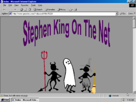
Figure 31

Figure 32
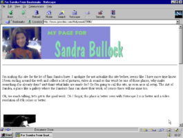
Figure 33
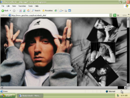
Figure 34
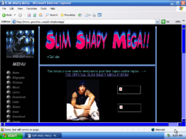
Figure 35
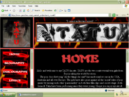
Figure 36

Figure 37
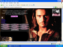
Figure 38

Figure 39

Figure 40
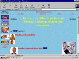
Figure 41
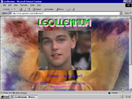
Figure 42
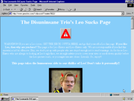
Figure 43
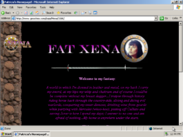
Figure 44

Figure 45
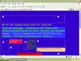
Figure 46
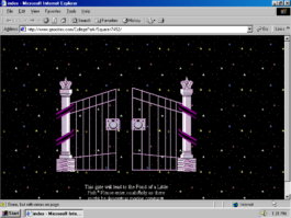
Figure 47
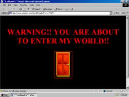
Figure 48
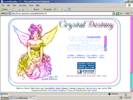
Figure 49
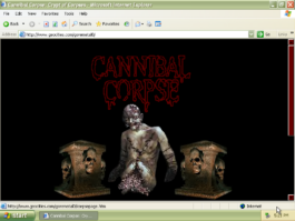
Figure 50
Just ME! Me! I’m me and there is no one else like me in the rest of the entire world. All about me and more. John, Kevin, Becky, Jake, Jason, Steve. [Fig.52–61]
Alongside the motivation to promote your ME that came from manuals and articles, there were some smaller, almost technical steps made by providers.
For example, as soon as Yahoo bought GeoCities they replaced the sample pages discussed above with templates. Personal Page Blue, introduced in summer 1999, is maybe the best known.72 What you see in Fig.62 is not only the original design, but also the original text, that in humorous form invited you not to be shy and to talk about yourself:
“Hi. Let me tell you about myself. Il [sic] like to eat. Sometimes I drink. Often I even sleep! And then in between all of those, I'll need to go to visit the bathroom. Most of the time I do all of those, practically every day! And sometimes I do things with other people. I used to go to school, but now I work. My favorite color is blue.”
[Fig. 63,64] Many registered their profiles but didn’t bother to change the text or never got to that point [Fig.65–67]. Text removed, picture exchanged, text exchanged, but not the picture. All possible combinations and variations, which never led to a page that would grow or be updated.73
Another frequently picked and abandoned “About Me“ template was techie2; it was reminiscent of the Matrix fonts and colour combinations [Fig. 68–70].
I want to believe that Fig.71 is Mark Zuckerberg trying out GeoCities by moving in the Wall Street neighbourhood 3 months before Facebook got operational. But I know there are good arguments to prove me wrong.
The screenshot in Fig.72 is almost identical, but pay attention to the address line.
It is not in the neighbourhood,74 but is a vanity profile – also a change introduced by Yahoo in 1999, another measure to make people think in terms of “me” not “my” categories.
Recently, at a One Terabyte Age workshop, a participant asked if it would make sense to visualise this rise of Me by arranging the pages according to the position of the About Me button in the navigation menu and see how it developed over time. I thought this would be rather a simplification and would object to the algorithmic approach, anyway, but what I saw with my own eyes would confirm that the About Me button indeed made itself a career and moved from the bottom to the top [Fig. 73–77].
In later history (Facebook), we would be able to remember the switch to the timeline, which was a push in the direction of telling the story of your life,75 to immerse in the history of your “me.”
I think it is also possible to distinguish the pinnacle of the transition from My to Me. It was very well highlighted (or even pushed) by the Person of the Year 2006 cover of Time magazine.76 You (me) were praised and celebrated and left in front of the mirror, to make selfies and post them on channels that would go bankrupt if their users didn’t produce – and produce for free.
Where My was dangerous, Me was perfect. Me is cheap, Me is easy to control, Me is easy to channel, Me is slave of its own reflection, Me is a slave of the platforms that make the reflection glossy. Me is data. Me is data closest to metadata. This makes Me just perfect to satisfy advertisers and to sate neural networks.
What can be done? How to reclaim My?
Don’t collaborate! Don’t post your texts where you are not allowed to turn it into hypertext.
Don’t post your pictures where you can’t link them to whatever you like. Don’t use content management systems that turn your GIFs into JPEGs. Don’t use hashtags, don’t accept algorithmic timelines. In short, make a web page and link to others who still have one.
Leaving monopolists and/or using alternatives is easy to suggest. And many of us made the first step – for example, created a page on neocities.org or on tilde.club, or even bought a superglue.it kit and hosted their home page at their actual home, supporting the Reclaim hosting initiative.
In December 2019, I asked the founders of the aforementioned projects whether they thought all these 5-year-old initiatives were still active. They were not optimistic about winning the competition with the giants (Dan Phiffer77 rightfully pointed me to the fact that I asked him about the Tilde Club not on Tilde Club but on Twitter). At the same time, Vasiliev’s,78 Drake’s79 and Ford’s80 answers – as well as Jim Groves’ aforementioned thoughts on “homeless” – suggested that in 2020 there would be more reasons to emancipate than in 2013, or better to say those reasons are stronger in 2020 than in 2013, and that may be the time and the motivation to leave.
But to quote developer and passionate “tilderer” Jon Bell: “How can we make something like this last longer than a sunrise?”
I think that leaving the platforms and meeting somewhere else is not enough, or not even the biggest deal. The challenge is to get away from Me, from the idea that you are the centre of your online presence. Don’t take this imposed, artificial role into the new environments. It will poison and corrupt the best of initiatives.
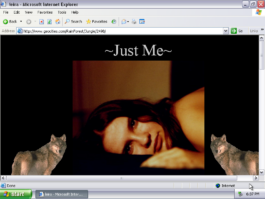
Figure 52
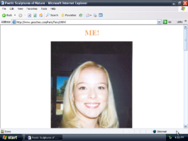
Figure 53
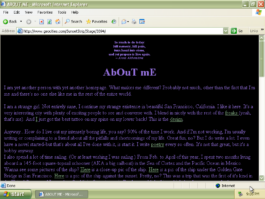
Figure 54
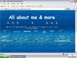
Figure 55
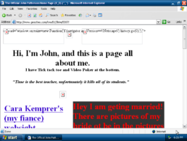
Figure 56
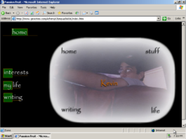
Figure 57
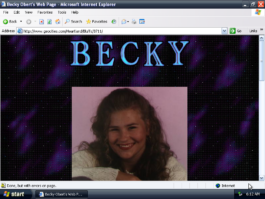
Figure 58
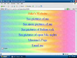
Figure 59
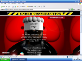
Figure 60
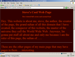
Figure 61
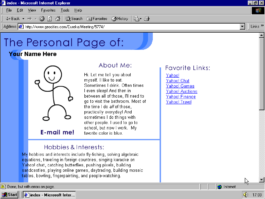
Figure 62
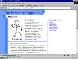
Figure 63
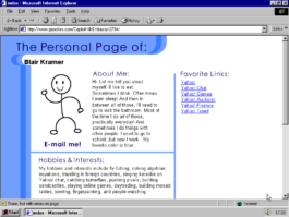
Figure 64
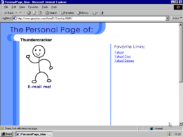
Figure 65
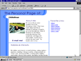
Figure 66
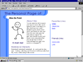
Figure 67
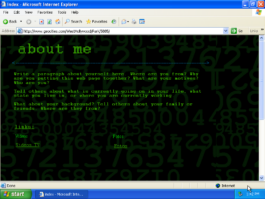
Figure 68
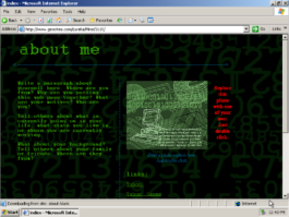
Figure 69
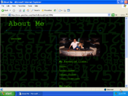
Figure 70
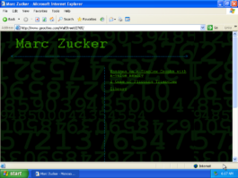
Figure 71
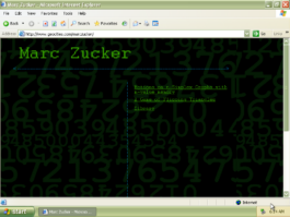
Figure 72
Figure 73
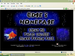
Figure 74
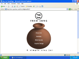
Figure 75
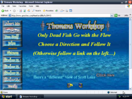
Figure 76
Figure 77
References
10 At this moment the GRI library has 83 items published between 1993 and 2002. Today they are my source of information, being very often the only reference to the websites that ceased to exist before they were preserved in any other way. A screenshot from a web design manual is nothing close to an archived website, it is also much less than an interview with a designer or developer of it. Screenshots are not sufficient, you can’t call them “good enough”, rather “at least something”, but as these web projects were too complex for web archives and too embarrassing for their creators to keep and recall – there is “at least something” you can reference, analyse or attempt to reconstruct.
FROM MY TO ME
Me is cheap, Me is easy to control, Me is easy to channel, Me is slave of its own reflection, Me is a slave of the platforms that make the reflection glossy. Me is data. Me is data closest to metadata. This makes Me just perfect to satisfy advertisers and to sate neural networks.
This text is part of the forthcoming book "Turing Complete User. Resisting Alienation in Human-Computer-Interaction" by Olia Lialina, that will be published in april 2021 through Heidelberg University Publishing. It contains five collected essays and will be available as print and open access, here on this website.
All the figures are screenshots of GeoCities web pages and are part of One Terabyte of Kilobyte Age Archive
Olia Lialina has published another essay on Interface Critique, called Rich User Experience, UX and the Desktopization of War.
This article is an elaboration on the statements about the WWW, web design and personal websites I made in my recent talks1 and articles, as well as those included in the volume. As the editor (and probably the readers as well) noticed, as soon as I look for counter examples to new media products made following the cruel and hypocritical UX paradigm, I come up with a website – or more precisely, with a website of a particular genre – “the 90s GeoCities”.2
This selectivity has reasons and is intentional. As a keeper and researcher of the One Terabyte of Kylobyte Age3 archive, I am surrounded by GeoCities sites built and abandoned by amateur webmasters between 1995 and 2009. Amateur websites are central to my argument because they are the corpus of the archive and my research on web history. This focus is not accidental, though – it was developed from the thesis that personal web pages are the conceptual and structural core of the WWW.
Their emergence was accidental, their time was short, their value and influence were downplayed, they were erased or hidden. And since this arrogance of the IT industry and Human Computer Interaction (HCI) circles was also not accidental, but followed the call of the “invisible computer”, the core instrument of which is alienating the users from their medium, I chose to argue for the opposite and to illustrate the argument with artefacts that highlight moments in the history of the medium when its users were in power.
The choice of the word “moments” and the use of the past tense is also intentional and deserves comment. The fact that the time of personal pages is over is self-evident. What is obfuscated by today’s early web nostalgia (netstalgia) trend, though, is the fact that there was never a time for them.
Just as there was no Web 1.0 period by itself. First of all, the term is retrospective. And second: the Web 2.0 marketing claim made by the Silicon Valley of 20044 regarding the Web’s future should not be allowed to define 10 years of web history prior to it as being neither homogeneous nor the opposite. There was no 2.0 cut into the history of the Web that left certain content and forms – namely personal websites – behind.
Nor was there some sort of evolution or natural development that would make people stop building their personal websites. Professionalisation or faster Internet, which you could hear as reasons for amateur pages dying out, could have become the reasons for the opposite, for a brighter, rich and long tradition of people building their cyberhomes themselves.
There was no time in the history of the Web when building your home was celebrated and acknowledged by opinion leaders. The idea that you should invest time in building your corners of cyberspace was mercilessly suppressed by hosting service providers and “fathers” of the Internet. The sarcastic “They may call it a home page, but it's more like the gnome in somebody's front yard”5 was stated not by some social networking prophet, not by, metaphorically speaking, Mark Zuckerberg or Jack Dorsey, but by Tim Berners-Lee himself, and it happened as early as 1996, the year we usually see as a golden age of amateur pages.
I have several suggestions for those who decide to make their home page in the third decade of the twenty-first century. Most of them will appear at the end, but there is one I’d like to make right away:
Don’t see making your own web page as a nostalgia, don’t participate in creating the netstalgia trend. What you make is a statement, an act of emancipation. You make it to continue a 25-year-old tradition of liberation.
Figure 1
Figure 2
Figure 3
Figure 4
Figure 5
Figure 6
Figure 7
Figure 8
Figure 9
Figure 10
Figure 11
Figure 12
Figure 13
To understand the history of the Web and the role of its users, it is important to acknowledge that people who built their homes, houses, cottages, places, realms, crypts, lairs, worlds, dimensions [Fig.1–13] were challenging the architecture and the protocols, protocols in a figurative not technical meaning. Users hijacked the first home page of the browser and developed this concept in another direction.6 A user building, moving in, taking control over a territory was never a plan. It was a subversive practice, even in 1995.
“Q: The idea of the ‘home page’ evolved in a different direction.
A: Yes. With all respect, the personal home page is not a private expression; it's a public billboard that people work on to say what they're interested in. That's not as interesting to me as people using it in their private lives. It's exhibitionism, if you like. Or self-expression. It's openness, and it's great in a way, it's people letting the community into their homes. But it's not really their home. They may call it a home page, but it's more like the gnome in somebody's front yard than the home itself.”7
Tim Berners-Lee didn’t intend to be sarcastic. It would be fair to quote the rest of the answer to see that what he called for was giving web users better, faster and more seamless8 ways to connect.
“People don’t have the tools for using the Web for their homes, or for organizing their private lives; they don't really put their scrapbooks on the Web. They don’t have family Webs. There are many distributed families nowadays, especially in the high-tech fields, so it would be quite reasonable to do that, yet I don’t know of any.”9
Such “webs” started to arrive some years later in the form of LiveJournal, Friendster, Facebook and other platforms that clearly showed web users that their part was to be connected and deliver content, not to build anything.
I don’t think that in 1996 anybody was really hurt or stopped making web pages because of the remark the father of the Web made. People building what was “not really their home” were reading other texts at that time: HTML manuals, web graphics tips and tricks, and source codes of each other’s websites. They would rather buy HTML for Dummies or Home Sweet Home Page and the Kitchen Sink than the WWW Consortium corporate journal.
Mentioning web design manuals is not a side remark here, but a suggestion to pay closer attention to the books that explained the World Wide Web to newcomers and taught them to make web pages as documents10 of the epoch: books such as Teach Yourself Web Publishing with HTML 3.2 in 14 Days; Building Your Own Website; Jazz Up Your Web Site in a Weekend; Frontpage Web Publishing & Design for Dummies; Publish it on the Web! – and other titles that shout: the Web is the future, the future belongs to you, learn HTML and embrace the future! The older the manual, the younger the medium, the more powerful and diversified is the role of the manual’s reader, the Web user. But in the context of this article I send you there not to look for the “good old days”. The manuals are also evidence of the personal web pages and their authors being ridiculed by experts: on the very same pages that motivated a newcomer you can often read “amateur” as a negative adjective.
“This page shouts ‘Amateur’"11
“There's nothing that says, ‘I'm an amateur Web designer and I don't know what I'm doing’ like 3-D logos”12
“Visit an amateur home page and see how excessive scrolling drags its nails across the blackboard of the user's experience”13
Already as early as in 1996, personal home pages as a genre and early web makers (as a group) were made fun of and blamed for all the ugly stuff. It is the year when David Siegel publishes Creating Killer Web Sites. Describing the history of the WWW till that moment, he announces the third generation of web design to come to replace the second-generation site, which for him was the world of amateur web and which he described as “At worst, noisy backgrounds and interminable waits for sound files make these sites unbearable. At best, they are nice white sites with color-coordinated icons”.14
“The audience for personal pages is basically only one person -- the creator of the site.”15
“It's perfectly OK for you to be as wild and crazy as you want because the only people who will probably visit your site are friends and family – and they are well aware of your lack of aesthetic taste.” 16
“ […] they cram every page with embedded MIDI (music) files, pointlessly scrolling JavaScript messages, huge full-color photographs, animated GIFs (flames and dripping blood are especially popular), and blinking and moving text [...] That is bad design, and (we think) bad markup, even if it validates – which is pretty unlikely because folks attracted to dripping blood animations tend not to spend much time learning about web standards.”17
The last quote is from Taking Your Talent to the Web, the book with the most beautiful title ever given to a manual. That’s why I borrowed it to be our library’s pseudonym.18 I also find this book very wise in many aspects: first and foremost for Zeldman’s conviction regarding the medium specificity of web practice and his attempt to divorce it from graphic design in this and other texts. Also, the work that he and his colleagues do at A Book Apart, a publishing house that makes manuals for contemporary web designers, cannot be underestimated. But I also think that it was a big mistake to neglect amateurs’ contributions to the development of the Web’s language.
In my opinion, people struggling to position a dripping blood animation in between two skulls and under <marquee>ENTER IF YOU DARE</marquee>, and pick up an appropriate MIDI tune to sync with the blood drip, made an important contribution to showing the beauty and limitation of web browsers and HTML code.
Making fun and blaming amateurs is only half of the problem. More damaging for the history of the Web was the ignoring of personal home pages and their authors in “how-to” books.
Neither the usability (Jakob Nielsen) nor the creativity (Jeffrey Zeldman, David Siegel) camps and their followers spared a page to analyse the home pages of amateurs, sorting things exclusively between themselves. From time to time they (as in Nielsen, Zeldman, Flanders) mentioned artists and web artists as exceptions to the rules they established, but not web vernacular. Even after designers of “photoshop” sites and dot.com unviable hybrids discredited the profession, experts suggested looking for new ideas among... professionals.
Veen: “I find inspiration in noncommercial Web creations”19 claims Veen and gives examples of designer portfolios.
“In order to move beyond a conservative, copycat style, you must look beyond the inbred corporate web to the personal sites of today's leading web designers”20 echoes Cloninger.
Danish researcher Ida Engholm in her 2002 paper “Digital style history: the development of graphic design on the Internet” wrote, “Web design has become an aesthetic phenomenon in its own right and with its own means of expression.”21
She continues: “Until now few attempts have been made from the perspective of aesthetic theory to develop reflective approaches to web design.” Ida Engholm was too cautious and modest with this remark. To my knowledge she was the first to attempt such an approach in the international academic press. And one can see that she was strongly informed (or misinformed) by the “how-to books” of the above-mentioned Siegel, Cloninger, Zeldman.
She writes: “[…] web design didn’t develop in a vacuum but shares features with development trends in 20th century design and art and with traditional design areas such as industrial design and graphic communication.” Following Cloninger she looks for web design roots in Swiss Style and Grunge, and discusses Kilobyte Minimalism, Hello Kitty and other popular online, but still graphic, design styles.
Indeed, web design didn’t develop in a vacuum, it grew out of vernacular web, it grew in opposition to vernacular expression. But there was obviously an information and education vacuum created around it by authors of design manuals and other experts and evangelists.
Only in 2008, in Fresher Styles of Web Design, Cloninger, following Cory Archangel’s Dirtstyle,22introduced “1996 Dirt style”, which he attributed to Myspace, blingee.com and other sites and communities “greatly influenced by hobbyist created personal home pages circa 1996”23 without giving a single example of any website from that era.
No wonder that young web designers think that responsive web design was invented this century, although Ethan Marcotte never hid the fact that he only coined the term,24 brought back and popularised the principle of liquid layouts, which was very popular among personal home page makers of the mid 90s; and why Aaron Walter, the author of Designing for Emotion25 – a web design manual that explains step-by-step how to create a service in a way that its users think that there is a real person behind it – dares to deliver his point without once mentioning a personal home page.
Webmasters and their production were an easy target. Professional designers, evangelists – they all took the opportunity: ridiculing, discrediting, alienating, exposing clean styles and templates, usurping the right to make design decisions.
And they succeeded, they protected the Internet from “wrong” colour combinations…, annoying background sound, from marquees and blinking, but in the long term it was the beginning of the end of web design itself. The rhetoric of alienation that design experts practised in 1996 was picked up by IT giants a decade later.
To quote Vincent Flanders’ (the extensively quoted above Flanders, who, book by book, article by article, humiliated websites that were too bright, too loud, too confusing) tweet from 4 years ago: “in 2016 web design is what Google wants it to be”.26 Even more true in 2020.
There is no web design and web designers any more, there are graphic designers and developers again, front-end and back-end developers this time. For me as a net artist and new media design educator, this splitting of web designer into graphic designer and front-end developer is bitter, because it is the death of a very meaningful profession.
“Web publishing is one of the few fields left where the generalist is valuable. To make a great site you need to know a little bit about writing, photography, publishing, UNIX system administration, relational database management systems, user interface design, and computer programming,”27 writes Philip Greenspun in Philip’s and Alex’s Guide to Web Publishing in 1999. It would be naive to think that it would work the same way two decades later, taking into account the complexity of modern online products. But still the web designer is a generalist in a leading position. But knowing a bit of everything is not the most important part of the profession. The generalist as web designer is a person who sees the medium designed and shows it to the users, a person who is growing up together with the medium (and never gets old because the medium is forever new) and who has the potential to reshape it, because intelligence is still on the ends.
“Web designers are still there though, I think. Just maybe more and more are actually growing into Frontend developers or turning to something more specific like becoming UI/UX designers, or Product designers. It's less browser focused maybe, less ‘web’? Even though most of these still technically rely on web protocols and technologies”28 – net artist at night and “full-stack developer with more experiences as a front-end developer” –, Émilie Gervais sees it more optimistically in our email correspondence but still confirms the shift: the Web is not a medium but underlying technology.
Underlying and invisible. Most of the digital products and interfaces we use today are in fact browsers opened in kiosk mode. The majority of mobile apps, digital signages, installations, and other big and small “experiences” are constructed with HTML, CSS and JavaScript. Front-end developers who can talk with screens and layouts in these languages are demanded, celebrated, well paid … but harmless; they master technologies without ambitions to master the medium.
Without web designers, the Web is left to front-end developers who implement Material Design guidelines (“what Google wants it to be”), graphic designers mix-n-matching “illstrations for every occasion”29 – and for the rest of us there is Artificial Design Intelligence (ADI).30
“There is no room for ornament on the web. People want to look at Instagram […] because their brain already understands how Instagram is laid out. In my opinion the goal of an artist vs a UX/UI/product designer is totally opposite. To combat templatization and minimalism I try to exaggerate designs with ephemeral styles and effects,”31 -- says Steph Davidson. She is web art director at Bloomberg, a publishing house that actually makes an effort32 to revive the genre – with a website that is different. Bloomberg designers are not the only ones. There are exceptions and we identify them as such. For example, every work of German web design duo Christoph Knoth and Konrad Renner makes people say “wow, the Web (design) is alive”. They confirm that “there is a small movement that is fusing web design back together with new tools. We design and develop frontends and backends and it feels like a perfect habitat for our work. We are the living proof”.33
“Small movement” is very important for rescuing the profession and the idea that one – be it a publishing house, a festival, a journalist investigation, a person – needs a website.
“[…] the idea of a site and its relationship to our online identity has far more depth of possibility than ever before, which makes me think the concept of having one’s own site online might never be more relevant given how ‘homeless’ our digital presence is online currently,”34 writes co-founder of Reclaim Hosting initiative, Jim Groom.
The homeless status is a reality for individuals, who never know when Facebook will implode together with their images and interactions, and for institutions begging Google and Wikipedia to edit their “knowledge panels”. Experts and celebrities are not better settled than naive users of Instagram.
Nothing is more eloquent than popular tech journalist Katie Notopoulos tweeting: “I had an idea for a blog, but realized that there's nowhere to like, make a new blog (rip tumblr), so I think the best blogging platform now is.... a really long caption on an Instagram?”35 or aforementioned web design guru David Siegel, whose web home today is a link list on Medium.36 Many links to his own text about the future of the Web once published on dsigel.com point to the Wayback machine.
The father of hypertext gave up updating hyperland.com and directed it to his YouTube channel.37 The mother of Post-Internet made a spectacular home page38 for marisaolson.com – the rest of her portfolio is outsourced to blocks and channels on arena.com. Among the ruins of online portfolios rises the home page of artist Petra Cortright,39 who links everything she’s done in between 2012 and 2019 to “petra cortright 2019 2018 2017 2016 2015 2014 2013 2012” on lmgtfy.com – a very contemporary gesture, which could be interpreted as both despair and arrogance.
In this situation I think a new role and an understanding of web designers could be rebuilding homes; showing gnomes the way out of corporations’ front yard, if I may steal Tim Berner-Lee’s metaphor.
These are not “ornaments” per se, Davidson mentions, and not the awesome audio visual effects Knoth and Renner provide to their clients; it is the notion of having an appearance – that they bring back by exaggerating it – and subsequently a place of your own outside of standard interfaces and grids of algorithmic timelines.
*
To turn designers and users away from technology and back to the medium one should try to adjust the optics and see the people who made the Web, to write the history of the users (not corporations that released these or those products, or updates) and frame it in a continuum of their actions, views, self-identification. Not an easy task because on the Web we are always confronted with revolutions, with histories of big men and binary time40 and space: before/after, web 1.0/web 2.0, desktop/mobile, flat/material.
My slow climb from 1995 to 2004 in the 1TB archive, my personal journey online that started in 1994 and is still not over, as well as two decades of teaching new media designers to see and show the environment they work with, we should recognise several trajectories we (web users) took since 1993.41
From web designer to front-end developer could be one of these trajectories. This is partially introduced on the previous pages. To make it complete I’d first of all have to place it in a more complex, forking path, starting from webmaster (not web designer), following the genesis and metamorphosis of that profession (passion) through time and niches of the Web.
Figure 14
Figure 15
Figure 16
Another trajectory, which would demand a longer text, is Under Construction → Update → Upload. The history of the Web distinguishing three generations – three “Us”. Where Under construction stands for building the Web; Update for having difficult relations with the Web, not having time for the Web, it’s complicated, “get a real life”, and more [Fig 14–16]; and Upload – users’ involvement reduced to feeding the forms with photos, texts, or other types of “generated content”.
Figure 20
Let’s have a closer look at “topgun’s Home Page” [Fig. 20], made and last updated in September 1995. A significant one for the archive: first of all because it is the oldest; second, it is one whose author I could trace, which is rarely the case; and third, because the creator, the person behind Bruce who is testing how to make a web page is none other than Ganesh Kumar Bangah, a big name in South-East Asian IT world: it was he who bought Friendster in 2009.42
In 1995 he was 16 years old and made his first home page by modifying a sample page made by David Bohnett, himself the founder of GeoCities, who was 40 at the time, but had maybe only some months more experience with the Web than Ganesh Kumar Bangah. David Bohnett’s first page was not saved, but in an interview he recalled that it was visually identical to Ganesh’s one (it was anonymous and placed into Hollywood Neighbourhood). This sample suggested two major ideas to the users signing in to his platform: they should or could be “under construction” and contain “links to other sites of the net” [Fig. 21–23]. A must that people took seriously, replacing Bohnett links with their own. Making links being the node was the duty,43 the reason or an excuse to be online. You are maybe not an expert in anything, you are not a fan of anybody, but you can provide links to others and that’s a noble role. These links could be to search engines [Fig. 18,24] and this didn’t look like a paradox.
Figure 18
Figure 21
Figure 22
Figure 23
Figure 24
“Links are the spice that makes the Web so interesting. Links perform the magic [...]”44
“There are no rules about which documents can point where – a link can point to anything that the creator finds interesting”45
“If you are building a site for people in growing roses, don't stop with just pictures of your roses; include the list of rose resource links”46
“Good home pages provide useful resources and links to other Web documents. Web is a project in community authorship”47
“There are sites that help you find people, sites that help you find jobs, sites that help you find other web sites,”48 The authors of the design manual Home Sweet Home stated in 1997, and they didn’t mean Google or search engines, they meant that it is a valid reason to create a website.
“There are plenty of sites around the World Wide Web that exist only to provide a Web ‘mouse potato’ with huge lists of links to pages that are informative, entertaining, or “cool”49
“Traditional home pages easily degenerate into an endless vertical list of links.”50 David Siegler’s remark sounds like a prophecy, knowing what happened to his own web presence. Indeed, webmasters were aware and often made an effort to transform the list into something rather intriguing, imagining and structuring them as a lava lamp [Fig. 25] or Christmas tree [Fig. 26]
Figure 25
Figure 26
The latter, “Links are us”, deserves special attention. It provided 100 links to what were, in 1999, important sources. Netscape is still there, Google is already there. Hans Hollenstein links to whitehouse.gov as well as “~” folders on .edu servers. But what does he put on the top of his Tree Full of Links? What’s the shiny Christmas star? Is it Microsoft? Apple? Yahoo? No, it is the author’s own complete solution to Rubic’s Cube51 as a Java applet… His invention, his pride and his right to make the link to it more prominent than links to the giants.
Back to our times. In the winter in early 2020, I taught a project “go as deep or stay as shallow”, which is a quote from Joshua Quittner’s Way New Journalism manifesto,52 an optimistic text published on Hotwired in 1995, where Quittner called to the journalist of 25 years ago not to be afraid of making links to immerse themselves in the world of hypertext and hyper images OUT there, outside of your text or publishing platform. The group I was teaching was very young. I knew I would be the first to tell them about the difference between the Internet and the WWW, the history of hypertext and hyperlink, the values of EtoE and the treasures of p2p, and of the urgency of breaking out of walled gardens, the importance of not obeying the one link Instagram allows you. I was prepared to start from the basics. What I was not prepared for was that students would ask me what I mean by the only one link that Instagram allows its users? Where is it?
They didn’t know about the link, they didn’t see it, and were not missing anything. I was trying to fire up a resistance against the cruel policy of Instagram, but achieved the opposite. It made Instagram even more generous in their eyes.
Then I told this to an older student of mine. By “older” in this case, I mean she had already had a conversation with me about blue underlined words some semesters ago and had produced several great projects. She said that, with all due respect to all the links I made, Instagram’s policy of not allowing links is great, it helps her to stay concentrated and to see only what she wants to see.
This is not a story about young people,53 it is the destiny of computer users of all generations. Adapting, forgetting, delegating.
So often we hear and say that things change very fast. I don’t know what is fast or what is slow, but what is clear to me is that the adaption of computer users’ mindsets keeps up with this pace. First you stop making links, then you stop following ones made by others, then you ask, “what’s a link?” Like a girl in the Apple commercial asks “What’s a computer?”54, a question that is supposed to portray the ultimate quality (transparency as invisibility) of a consumer electronic product.
Computer users accepted that making links is not their business. Instagram’s one and only link in bio is not a question of the amount of links but the fact that the decision to make hypertext is not a prerogative of the users.
“Free speech in hypertext implies the ‘right to link’, which is the very basic building unit for the whole Web”55 writes Tim Berners-Lee in 2000. He adds, “if the general right to link is not upheld for any reason, then fundamental principles of free speech are at stake, and something had better be changed.”56
Links were indeed perceived so “basic” and “fundamental” that no contributor to user rights platform thought about adding a demand to link in 2013 or later. I noticed this while finishing this text and tried to improve the situation by placing my demand.57 But one thing that has long existed is the unwillingness of corporations to make external links and the rise of walled gardens, where hypertext is only inside,58 and links are made between documents not servers. And another is service providers taking away the technical possibility of turning text into hypertext, media into hypermedia, even inside one platform.
The <a href> tag is the most essential tag of HTML. A is for “anchor”, HREF is for hypertext REFerence – <A HREF> is to tie, to weave, to knit. One would think it is the essence and the core, but we see more and more signs that in a year or two it will be “deprecated”, browsers will just ignore it as some sort of <blink> or <marquee>, as if it is something decorative, but unnecessary, just a feature, that can be removed.
Content management systems and WYSIWYG web publishing (among other solutions that would make publishing instant) made a very attractive offer to their users: authors don’t use tags to make links, just type “https://” and the platform will recognise it and automatically turn the address into the link. But a decade later they started to change their mind and URLs stayed inactive, appearing more as noise than information. Since 2016, Instagram users have wondered how to make links, how to go around “non-clickable URLs”,59 as hyperlinks are now called – an absurd collocation for an environment based on hyperlinks. “For the Web, the external link is what would allow it to actually become ‘worldwide’”,60 to quote its inventor once again.
There are more sad neologisms around, for example the “Clickable Links”61 extension I installed to make URLs “work” in Chrome, or “Linkificator”, it’s analogue for Firefox. Not to mention PANs like linktr.ee and il.ink, apps that you have to install to move round the only link Instagram allows. The mere existence of the apps shouts about the absurdity of today's web, the hypocrisy of social networks and the misery of their users. “The only link you’ll ever need” is linktr.ee’s slogan, with which I marked the current moment in the trajectory.
“... hyperlinks aren’t just the skeleton of the web: They are its eyes, a path to its soul.” Iranian blogger Hossein Derakhshan wonderfully said in his 2015 post on Medium, the title of which was “The web we have to save”.62
Derakhshan spend 6 years in prison for his posts online. He was released, went back on the Internet and viewed it as terrible that Facebook would not let him link properly and control the presentation of his texts. He was absolutely right in his critique.
At the same time I remember being puzzled when reading this text 5 years ago, because I realised that in his memories WordPress was paradise for links and the golden age for hypertext and the Web we have to save. How could this be? In my chronology, WordPress was the platform that started to take away users’ control over the links; it is precisely WordPress that should be blamed for disrespecting hypertext, as it filled the Web with zombie links.
The question is rhetorical. We know the answer: we (users of free publishing tools) forget or adapt or accept very quickly.
Much like the false memories about WordPress is the current Myspace nostalgia,63 namely the part where people recall their time on this platform as a time when they were coders. US scholar Kate M. Miltner presented her research “MySpace Had Us All Coding”: A Nostalgic (Re)imagining of ‘Web 2.0’”64 about it at last year’s conference “The Web That Was”. Again, I had the impression that she was talking about another Internet or Myspace, because I remember the opposite, and in 2007 I wrote about Myspace as a platform that took HTML as a source code away from people.65
But true, when you compare the Myspace of that time with any service of today or even the Myspace of today, you feel like you were a coder if not a programmer. You could copy and paste glittering text code, decide whether sparkles are purple or pink.
I asked the audience whether, in a few years’ time, teenagers who are now on Instagram will recall 2019 as a paradise, as a free wild web, a place when they were coders? Can it be that people who are on Instagram now will be nostalgic about the freedoms they had?
“Of course! Thank you, Instagram – we were allowed to upload!” Alex Gekker of Amsterdam University shouted from his seat.
Indeed, happy times when you could decide yourself to post a pic and not your phone doing it for you automatically. We will be recalling the 2010s as a time when we could post images ourselves.
Good old times... Remember Instagram where you could post an image?
Remember Google that allowed you to type your search request? We had Twitter! You could unfollow people! Yes! Yes, in 2020 there were browsers that had a location bar and you could type in an address of a site!!
What? Address bar? Website? You could type? Was there a sort of typewriter?
Delegating, adapting, forgetting.
Another timeline that vividly exposes this path would be from making a website for your own dog to reposting someone’s cat. There are transitions in between these extremes: making a website for a cat, or posting your own cat. It is a trajectory to follow, to investigate. Again it is not binary, not just a dog’s web for Web 1.0 vs a cat’s web for Web 2.0. Though my research shows that cats, which later became a front-running symbol66 of being online, played a small role in early web culture, and had another function.67
Figure 27
Figure 28
Figure 29
Figure 30
The page [Fig.27] is one of 848 pages tagged as “dog” in the One Terabyte of Kylobyte Age archive (as of june 7, 2020). The most spectacular ones have become part of an ongoing online exhibition.68 Many of these pages are made in memory of a dog, many to celebrate a new puppy, some are personal, others belong to breeders. There are monumental and very simple ones, and some that I found are especially stunning. I tag them as “dog” and “webmasters” and there are 99 of them at the moment. Almost 100 of 848 dogs claimed they made their webpage themselves.[Fig.28–30]. We (people who are a bit older than these pages) know that it is not true. But for how long will this knowledge be there?
Chances are that the number of people who have ever heard about web pages made by people themselves is getting smaller every month. At the same time, the chances that your dog, cat or hamster doesn’t need you to share its pictures and sounds online are getting higher every day. I’m sure that if you return to this exhibition in ten years from now and see the screenshots, you won’t be surprised by dogs showing off their pages or posts. Theoretically, some sort of Alexa could probably already do it today, automatically photographing your pet, streaming it live, translating its barking into words and whatever.
And that’s why I invite you to go into these pages in more depth: not to forget that these dogs were not dogs but people who spent a few weekends learning how to make a web page, and it was so exciting and so much fun that they also made them for their dogs. People, not dogs, not AI, not UX were making decisions about URLs, links, navigation, layouts, colour palettes and content.
Webmasters of the 1990s built homes, worlds and universes. But also, outside of intergalactic ambitions, they strongly pushed the concept of something being mine. The first-person possessive determiner “my” took on a very strong meaning – “my” because I build it, I control this presentation; my interests, my competences, my obsessions: in the trajectory from my to me, I suggest following its decline.
Figure 31
Figure 32
Figure 33
Figure 34
Figure 35
Figure 36
Figure 37
Figure 38
Figure 39
Figure 40
Figure 41
Figure 42
Figure 43
Figure 44
Figure 45
Figure 46
Figure 47
Figure 48
Figure 49
Figure 50
[Fig.31–45] My Steven King, my Korn, my page for Sandra Bullock, my Eminem, somebody else’s Eminem, my t.A.T.u., My Orlando Bloom, your Orlando Bloom, Martin’s Mylène Farmer, Julia’s John Malkovich, Jacob’s pictures of Pamela Anderson. They are Jacob’s because he scanned them and put them online. My space for Leo, and my territory without him. Patricia’s Xena, but not only because she is her fan; it is a page about Patricia’s dreamworld where she is Zena. And this is a very important dimension of My. An alternative my-self. Alternative space where one can be someone else, someone that they want to be. Emphasis on MY! [Fig.46]
The growing idea that things can belong to the person who wrote an html code, or scanned pictures, or collected something was unprofitable and dangerous. Today, users put a gate or a door on their page [Fig.47,48]. And what tomorrow? Will they start to think that the files behind them belong to them? And the day after tomorrow, will they come round to thinking hat their data should not be exposed or sold?
Today they change the colour of the scroll bar [Fig. 49,50] adapting it to the theme of their imaginary world, so what’s next? Will they come around to the idea of installing a browser extension, or write one!
Dangerous!
Figure 51
Through the second part of the 90s, service providers took many actions to reduce and restrict: rewriting Terms of Service (ToS) and taking away frameworks,69 not developing tools that would make it easy to update and communicate – editors, guestbooks, or web rings; and developing tools and services that would (theoretically) require the least effort, simultaneously promoting the idea of IRL, of some real life70 that you were allegedly missing when making your web page.
But the smartest and most effective move the industry made (the aforementioned measures wouldn’t work without it) was to push people from My to Me. To introduce forms that would motivate people to see themselves as the main – and then the only – content of what they do online. I’d like to stress that although early web pages (or home pages) are remembered as personal, the person who made it was not the initial content; that turn took place later.71
Figure 52
Figure 53
Figure 54
Figure 55
Figure 56
Figure 57
Figure 58
Figure 59
Figure 60
Figure 61
Figure 62
Figure 63
Figure 64
Figure 65
Figure 66
Figure 67
Figure 68
Figure 69
Figure 70
Figure 71
Figure 72
Figure 73
Figure 74
Figure 75
Figure 76
Figure 77
Just ME! Me! I’m me and there is no one else like me in the rest of the entire world. All about me and more. John, Kevin, Becky, Jake, Jason, Steve. [Fig.52–61]
Alongside the motivation to promote your ME that came from manuals and articles, there were some smaller, almost technical steps made by providers.
For example, as soon as Yahoo bought GeoCities they replaced the sample pages discussed above with templates. Personal Page Blue, introduced in summer 1999, is maybe the best known.72 What you see in Fig.62 is not only the original design, but also the original text, that in humorous form invited you not to be shy and to talk about yourself:
“Hi. Let me tell you about myself. Il [sic] like to eat. Sometimes I drink. Often I even sleep! And then in between all of those, I'll need to go to visit the bathroom. Most of the time I do all of those, practically every day! And sometimes I do things with other people. I used to go to school, but now I work. My favorite color is blue.”
[Fig. 63,64] Many registered their profiles but didn’t bother to change the text or never got to that point [Fig.65–67]. Text removed, picture exchanged, text exchanged, but not the picture. All possible combinations and variations, which never led to a page that would grow or be updated.73
Another frequently picked and abandoned “About Me“ template was techie2; it was reminiscent of the Matrix fonts and colour combinations [Fig. 68–70].
I want to believe that Fig.71 is Mark Zuckerberg trying out GeoCities by moving in the Wall Street neighbourhood 3 months before Facebook got operational. But I know there are good arguments to prove me wrong.
The screenshot in Fig.72 is almost identical, but pay attention to the address line.
It is not in the neighbourhood,74 but is a vanity profile – also a change introduced by Yahoo in 1999, another measure to make people think in terms of “me” not “my” categories.
Recently, at a One Terabyte Age workshop, a participant asked if it would make sense to visualise this rise of Me by arranging the pages according to the position of the About Me button in the navigation menu and see how it developed over time. I thought this would be rather a simplification and would object to the algorithmic approach, anyway, but what I saw with my own eyes would confirm that the About Me button indeed made itself a career and moved from the bottom to the top [Fig. 73–77].
In later history (Facebook), we would be able to remember the switch to the timeline, which was a push in the direction of telling the story of your life,75 to immerse in the history of your “me.”
I think it is also possible to distinguish the pinnacle of the transition from My to Me. It was very well highlighted (or even pushed) by the Person of the Year 2006 cover of Time magazine.76 You (me) were praised and celebrated and left in front of the mirror, to make selfies and post them on channels that would go bankrupt if their users didn’t produce – and produce for free.
Where My was dangerous, Me was perfect. Me is cheap, Me is easy to control, Me is easy to channel, Me is slave of its own reflection, Me is a slave of the platforms that make the reflection glossy. Me is data. Me is data closest to metadata. This makes Me just perfect to satisfy advertisers and to sate neural networks.
What can be done? How to reclaim My?
Don’t collaborate! Don’t post your texts where you are not allowed to turn it into hypertext.
Don’t post your pictures where you can’t link them to whatever you like. Don’t use content management systems that turn your GIFs into JPEGs. Don’t use hashtags, don’t accept algorithmic timelines. In short, make a web page and link to others who still have one.
Leaving monopolists and/or using alternatives is easy to suggest. And many of us made the first step – for example, created a page on neocities.org or on tilde.club, or even bought a superglue.it kit and hosted their home page at their actual home, supporting the Reclaim hosting initiative.
In December 2019, I asked the founders of the aforementioned projects whether they thought all these 5-year-old initiatives were still active. They were not optimistic about winning the competition with the giants (Dan Phiffer77 rightfully pointed me to the fact that I asked him about the Tilde Club not on Tilde Club but on Twitter). At the same time, Vasiliev’s,78 Drake’s79 and Ford’s80 answers – as well as Jim Groves’ aforementioned thoughts on “homeless” – suggested that in 2020 there would be more reasons to emancipate than in 2013, or better to say those reasons are stronger in 2020 than in 2013, and that may be the time and the motivation to leave.
But to quote developer and passionate “tilderer” Jon Bell: “How can we make something like this last longer than a sunrise?”
I think that leaving the platforms and meeting somewhere else is not enough, or not even the biggest deal. The challenge is to get away from Me, from the idea that you are the centre of your online presence. Don’t take this imposed, artificial role into the new environments. It will poison and corrupt the best of initiatives.
References
10 At this moment the GRI library has 83 items published between 1993 and 2002. Today they are my source of information, being very often the only reference to the websites that ceased to exist before they were preserved in any other way. A screenshot from a web design manual is nothing close to an archived website, it is also much less than an interview with a designer or developer of it. Screenshots are not sufficient, you can’t call them “good enough”, rather “at least something”, but as these web projects were too complex for web archives and too embarrassing for their creators to keep and recall – there is “at least something” you can reference, analyse or attempt to reconstruct.